UAL Fundraising campaign
A campaign system where creative education doesn’t respond to the future, it builds it.
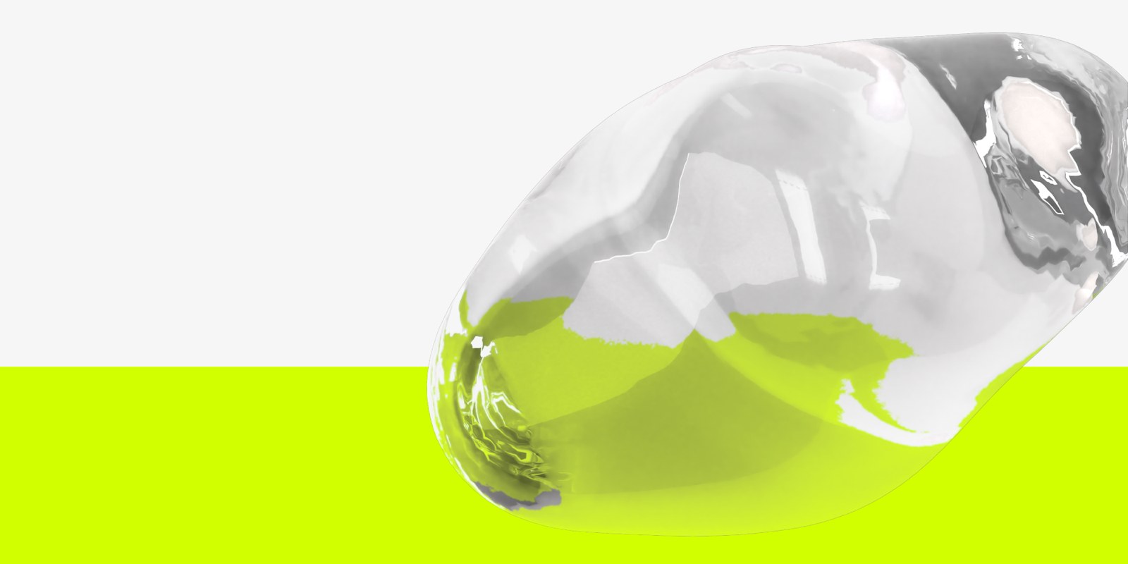
University of the Arts London is one of the world’s leading creative universities, preparing to launch its first-ever fundraising campaign.
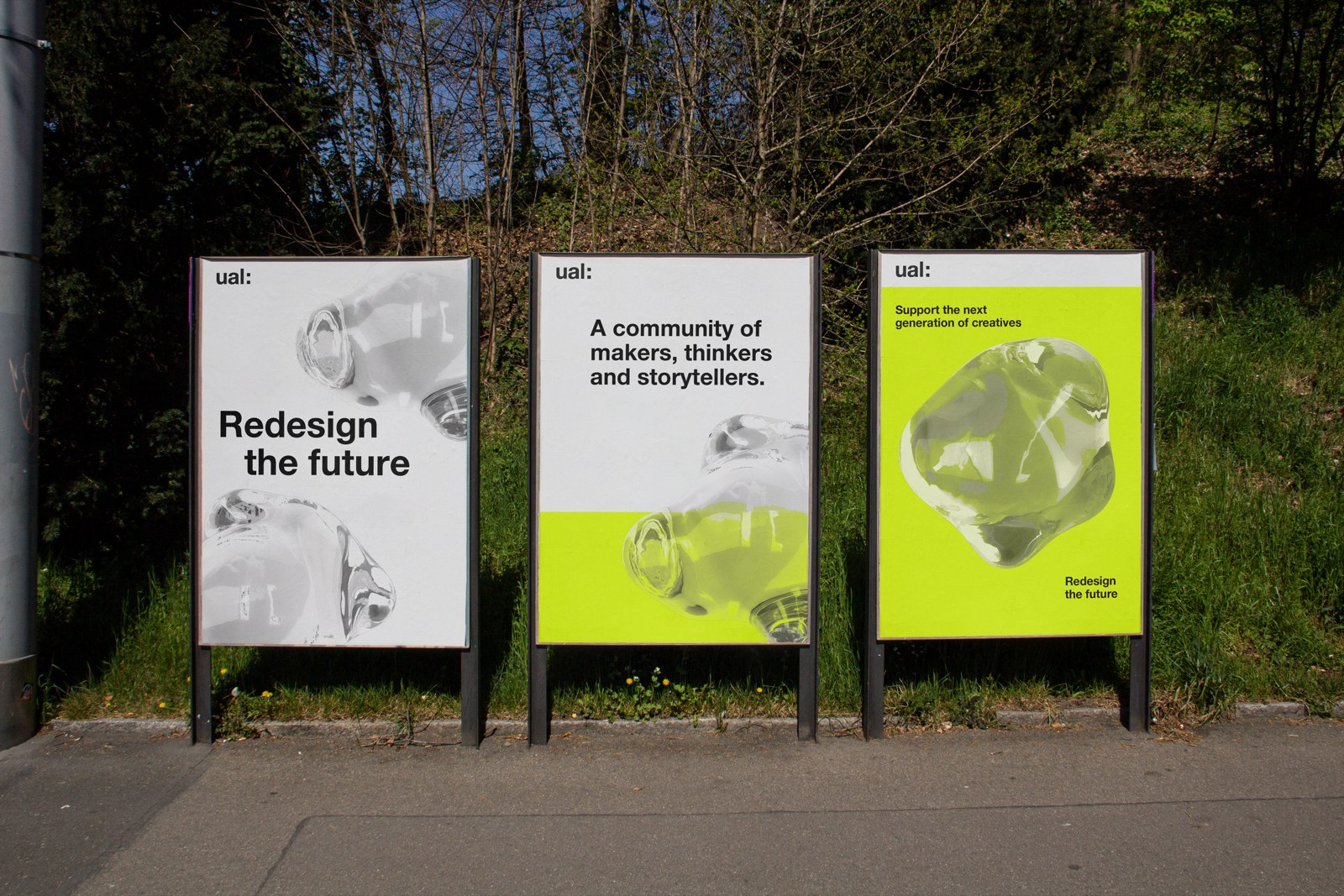
An identity to engage major donors at a new scale, showing what is at the core of UAL’s creative practice without losing institutional credibility.
The tension between precision and the unexpected.
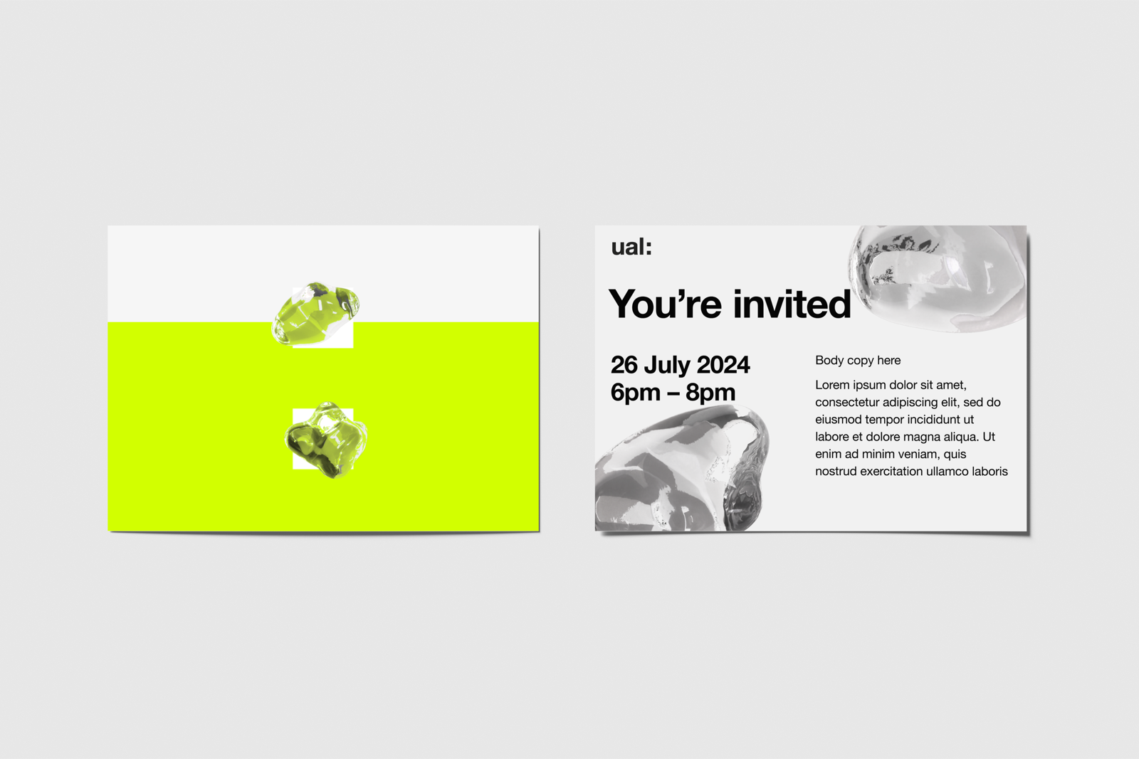
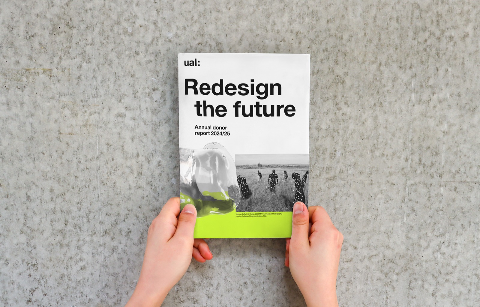
A rising colour block responds to contribution. It is responsive, precise and predictable. The closer the campaign gets to its goal, the higher the bar climbs, making collective impact legible in real time.
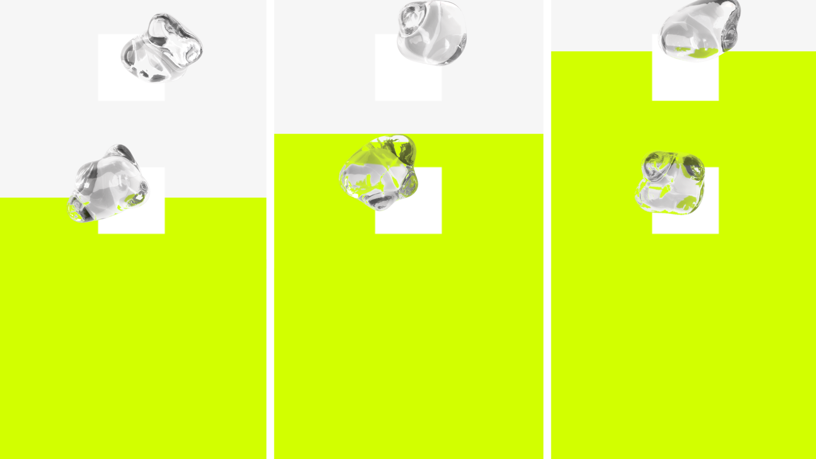
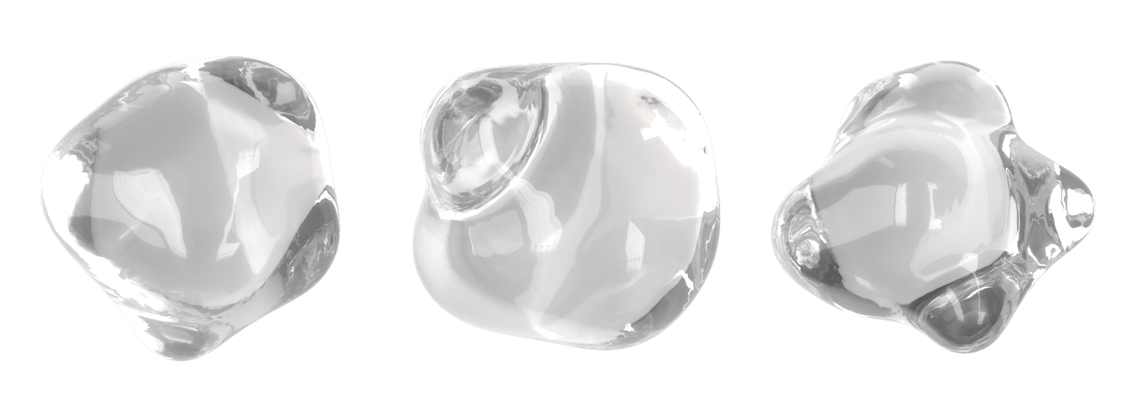
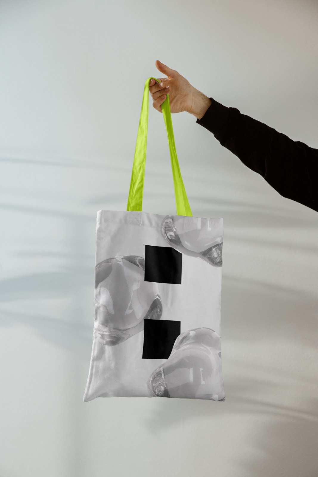
The shapeshifter. It breaks the grid, bringing the unexpected and exploring paradoxes. It refracts and integrates everything it touches: student work, images, text. The students shape the glass; the glass pushes the bar up.
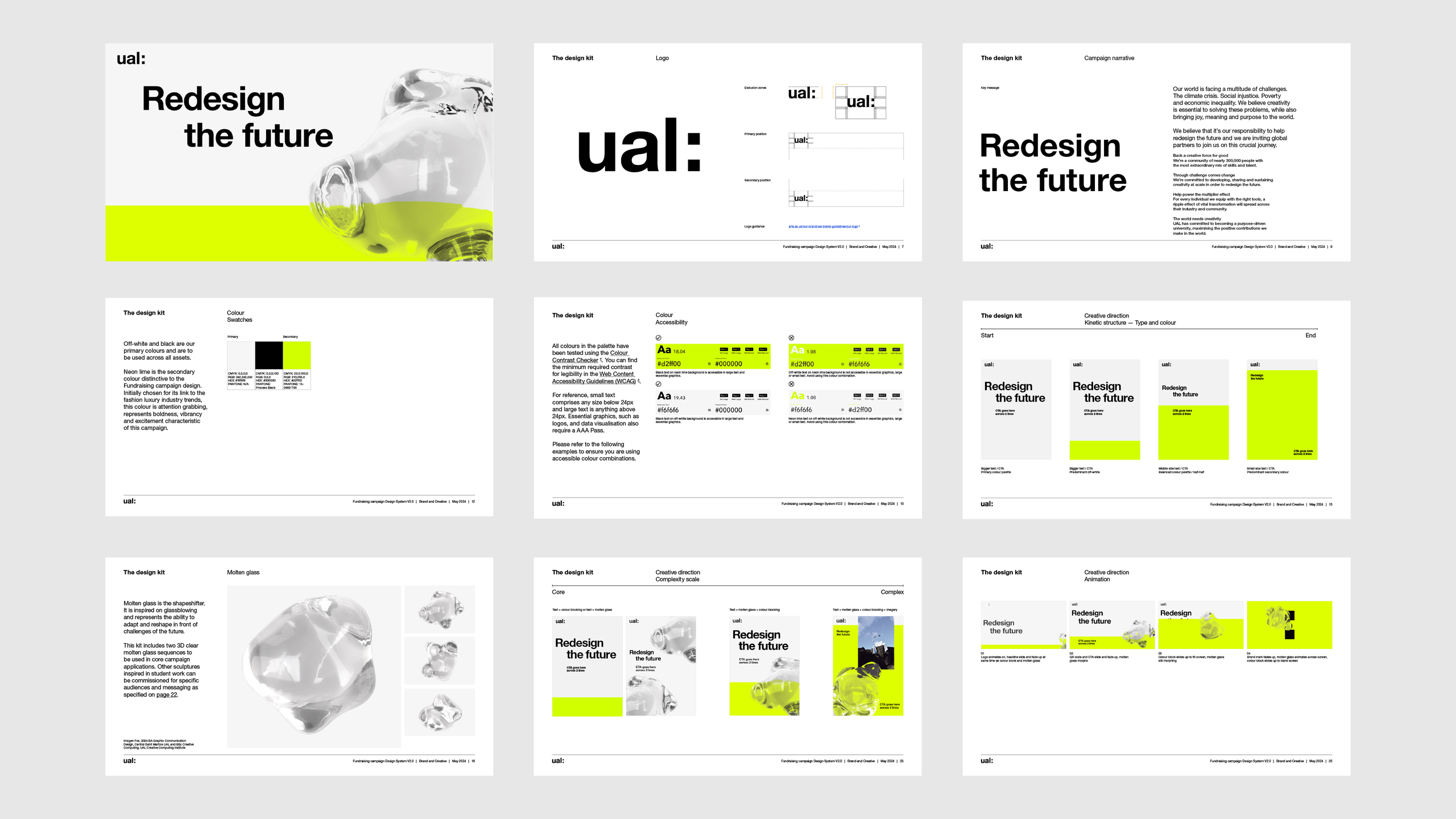
Typography increases or decreases in size, moves right or left. It is placed in different areas of the composition, following a flexible grid.
3 colours: off-white, black and neon lime. Neon lime was initially chosen for its link to trends in the luxury fashion industry; it is attention-grabbing, bold and vibrant.
Imagery spotlights student work. It is aspirational, transformational, active and provocative. Used in full colour or black and white.
A two-edition identity system for London College of Fashion’s graduate show, marking its post-Covid return.